A locally owned tech repair and support business serving the DC metro area since 1994.
UX researcher, designer, front-end developer
Here is a video walkthrough of anchorcomputers.com.
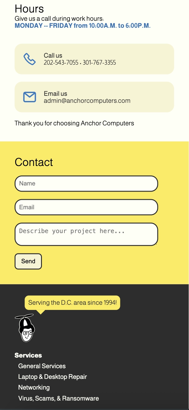
Multiple contact entry points for users to initiate contact with Anchor Computers. This includes phone number and email cards and a PHP email form embedded in the site.
Impact: Encourages users to take action — email, call, or fill out the form.

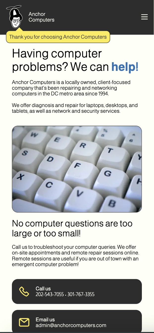
Designed with Flexbox and media queries to ensure smooth experience on mobile, tablet, and desktop. Maintained visual balance using column layouts and scalable containers.
Impact: Mobile compatibility increased usability for all customers!

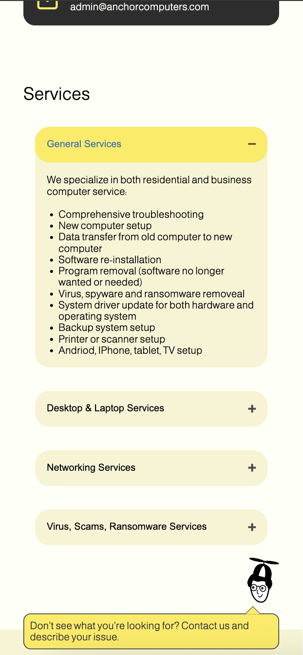
Organized long lists of services into expandable dropdowns reducing visual clutter. Users can scan and expand only the sections relevant to them. Hover effects add clarity and responsiveness.
Impact: Reduced content overwhelm, improved findability.

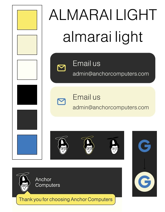
Consistent and clean color and font choices. Designed custom components (like speech bubbles and mini-contact cards) for brand personality.
Impact: Stronger brand identity and visual coherence. Design system foundation.

The final design achieved a clean, modern interface that’s easy to navigate, visually consistent, and conversion-driven. It encourages trust and contact from a wide user base — from busy professionals to elderly users seeking tech support.
Create a responsive map to increase interactivity and give clientele a more descriptive location.
This was my first HTML and CSS project! I have a better understanding of best practices and hope to revamp my code in the future to reflect my new skills.