Wayback Machine
About
This project was a challenging thought exercise between the balance between form and function. Overall, our group worked together to:
Define pain points
Brainstorm new designs/layout
Improve branding with 90s inspired UI
Redesign with user flows
Created by: Allison Elpiner, Ashley Chau, Janice Imuze, Roseabella Mvemba
Pain Point
So much clicking! So many buttons that navigate to a new page. The process of uploading a page takes users to three different screens when it could easily be one.

Solution
Previously, uploading a page required multiple navigations ot various pages and long loading times. First, a user would click on upload page, then they would be routed to a new screen in which they could drag/drop their object.
Now, we have shortened that process to one page where a user can enter a URL, and drag/drop in the same screen.
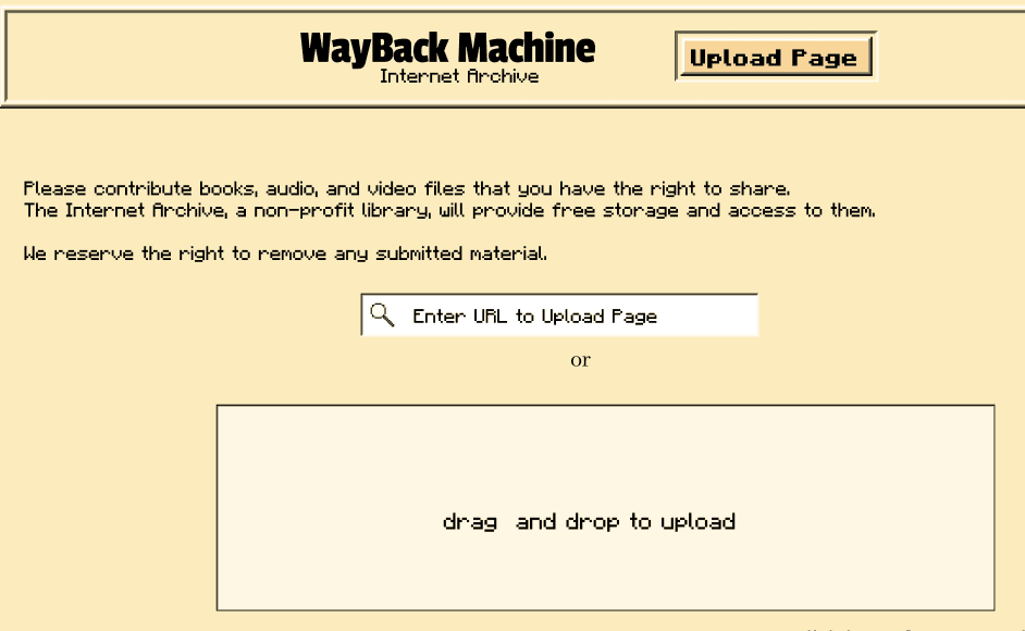
Goal
Shorten user flows and implement more vertical scroll rather than page navigation.
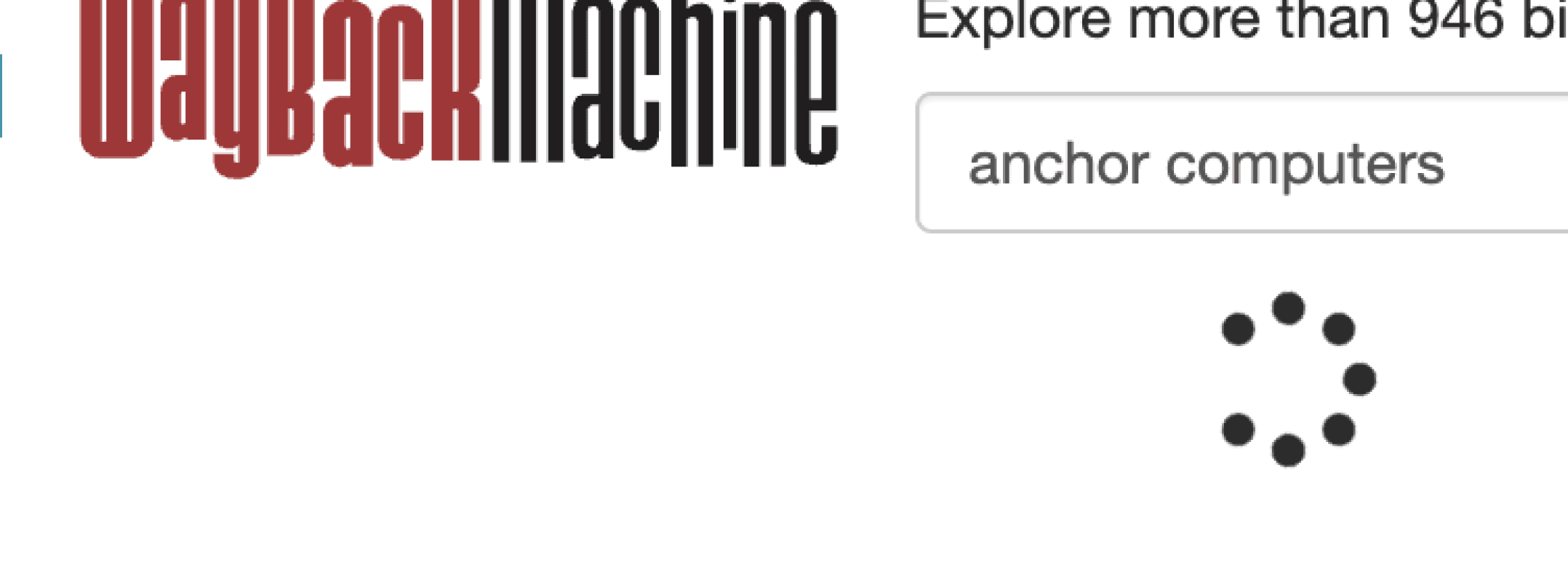
Pain Point
Forgettable. The Wayback Machine is quirky by nature. There is hints of this idea within the logo but does not translate through the rest of the site.

Original Logo
Goal
Redesign includes 90s inspired ui to improve branding
Solution
Inspired by this picture from Windows 1999 we created a design system using harsh drop shadow borders to create separation between UI components.
Our icons are built from individual pixels to create an old-school look. Our color palette was inspired by manilla folders. Our font is from the popular video game Minecraft.
Pain Point
Few options for navigation. Having a scroll bar or buttons is great for giving users options for how they want to navigate on a site and also improve accessibility but the Wayback Machine only allows for mouse navigation OR minimal keyboard navigation for most interactions.

Users must drag and scroll to find date or press arrow buttons which is very inefficient.
Solution
Improved the efficiency when picking a date using buttons/keyboard (left) by adding a dropdown for month and year. Previously, users could only press arrows to go to the neighboring screenshot, which was an inefficient way to navigate on popular sites. Now, users can choose an exact date through their keyboard.
Another method to pick a date was through a drag bar (right). We made the drag bar larger and more visible so users can better tell where they are on the timeline.

Goal
Improve UI of date picker to be more accessible and efficient.
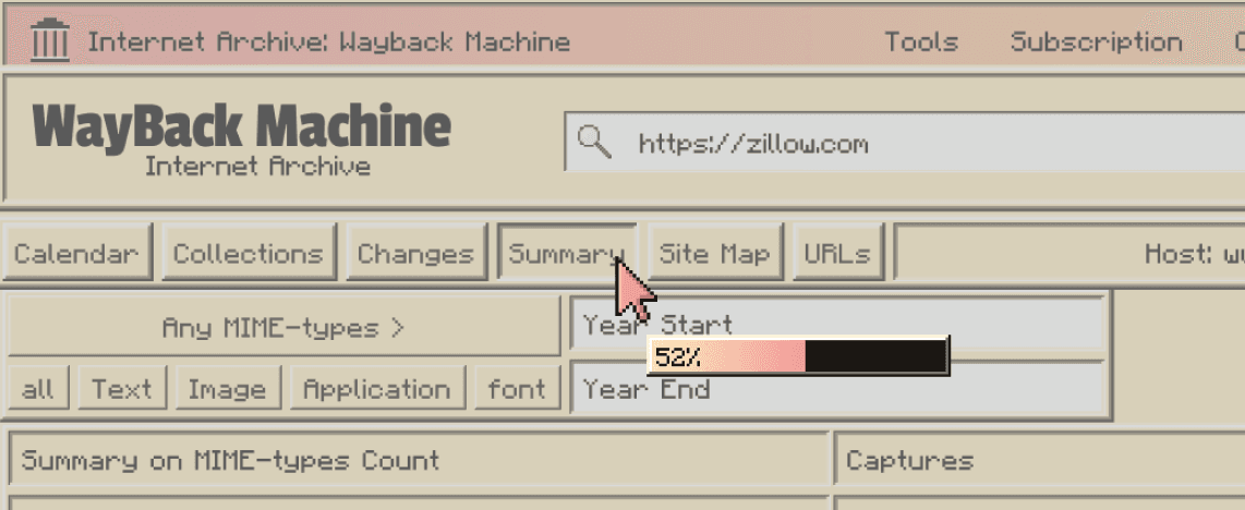
Pain Point
Lack of communication. The Wayback Machine tends to have long loading times, which can’t be helped as its a massive archive. However, there is no communication of progress to users besides simple loading circles
Loading circle doesn’t show progress to users.
Goal
Find loading options that share progress with user so they don’t give up and click away.
Solution
Our loading bar is attached to the cursor and includes a visual representation of progress made as well as a percentage. This tells users an approximate time they will spend waiting for the Wayback Machine to complete tasks.
Wayback Machine
Reflection
This group project gave me the opportunity to create a quirky and fun design system (which also inspired the look and feel of this portfolio!) It was an exciting challenge, especially given the complexity and breadth of functionality within the Wayback Machine. While there were four of us collaborating on improving user flows, the sheer number of features meant we couldn’t redesign everything within the project’s timeframe.
This experience deepened my appreciation for working efficiently and making design decisions quickly. Although building the design system took significant time and effort, I’m proud to have completed it on my own. It allowed our team to assemble pages rapidly and gave me a firsthand understanding of the value a strong design system brings to collaboration and speed.