Mid-Fidelity Prototype: Home Screen
I created a very basic design system with three main colors to represent the different functions zillow has to offer (Buy, Rent, Sell).
I worked on organizing information Zillow offers to users.
I realized how much information Zillow shares with users. I found it difficult to include all the relevant information about each property on the home screen while maintaining cohesion and aesthetics.
I also struggled staying consistent with font and spacing.
I was confident in my home screen layout. Separating each function by color was an interesting way to improve usability and promote organization within the app.
Mid-Fidelity Prototype: Gallery Screen
When looking at a property in more detail, I wanted to create separation between different characteristics of the house such as price, size, bedrooms, ect. I accomplished this by creating grey modules.
The header I created has an updated zillow logo and includes mini Buy, Rent, and Sell buttons.
Creating separation between pieces of information is a good idea. I was also pleased with my logo redesign.
Creating this separation with gray modules was a start to improving usability, however, I did not use a grid format which could be overwhelming for a user.
The Buy, Rent, and Sell buttons look more like profile icons, and I questioned whether they were really necessary on this page.
Zillow Redesign
About
A recreation of Zillow using Figma with the goal of updating the website’s style and creating a workable mobile solution of four Zillow screens. This was an individual project.
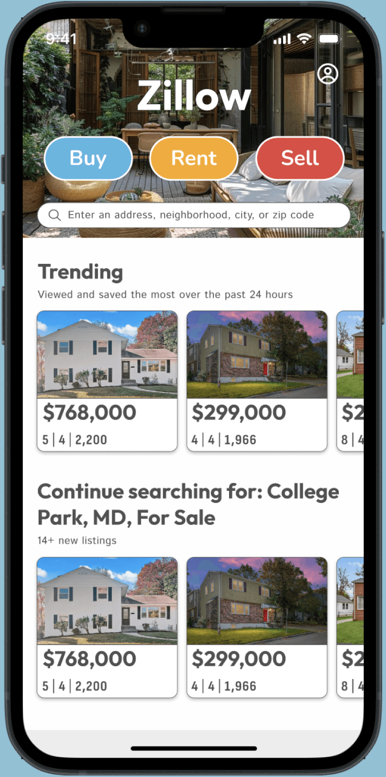
High-Fidelity Prototype: Home Screen

I finalized my design system including colors, fonts, transparency, and shadows. I was more aware about consistency and spacing.
High-Fidelity Prototype: Sell Screen
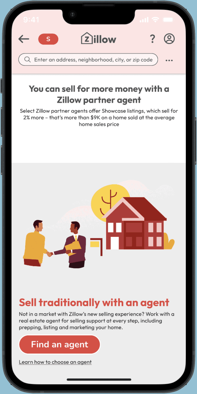
I created a sell page using this design system. I Included all the information on the original Zillow website.
Design System

This is the design system I referred to in order to stay consistent throughout this project. It was my first time experimenting with a design system!
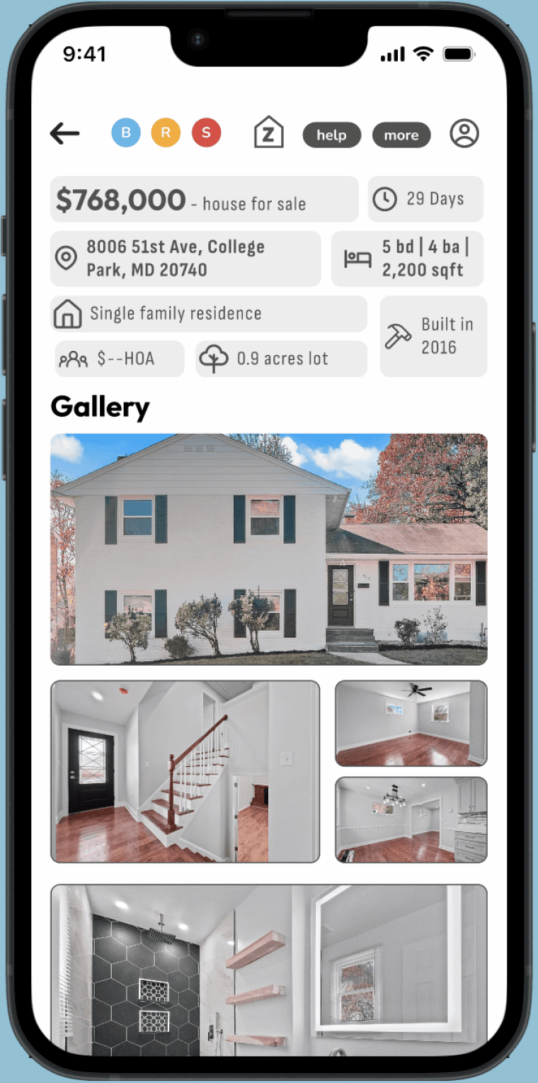
High-Fidelity Prototype: Gallery Screen

I changed the size and shape of Buy, Rent, and Sell buttons which helps prevent misidentification as profile icons.
I created a stronger grid for the modules and utilized text hierarchy to the most important elements.
Zillow Redesign
Reflection
This project highlighted the importance of iteration and the value of accepting feedback throughout the design process. By seeking input from other designers and being open to constructive critiques, I was able to significantly refine and improve my work between two iterations.
Each piece of feedback provided new perspectives that helped me enhance both the aesthetics and functionality of my design.
Additionally, I gained a deeper understanding of the importance of creating reusable components. By breaking down my design into repeatable elements, I was able to stay more organized and efficient. This approach allowed for consistency across different parts of the design. The use of components also allowed me to easily adapt to future changes without starting from scratch each time.